Think for a moment about a field, half filled with rabbits.
How can we figure out how many fluffy bunnies we’ll have in a year’s time?
Let’s start by agreeing to use a population of 1 to mean a field full of rabbits, whereas zero would mean no rabbits at all. A population value of 0.5 would mean the field was half filled with bunnies. It works like a percentage, where 1 is 100% of the field, 0.5 is 50% of the field covered in rabbits.
With this arrangement we might use a really simple equation like Xn+1 = λXn to model growth over say a year. The value λ would be our growth (or bunny fertility) rate. Xn would be the current population of rabbits in the field right now and Xn+1 will be the new population we’ll expect to see in a years’ time: after they’ve all been munching grass and, you know… doing what rabbits do.
So we could use: Xn+1 = λXn
But hang on a second, that simple equation can’t work! As each year goes by, the numbers of rabbits would simply keep increasing (due to λ multiplying them) in other words this silly thing doesn’t take into account disease, predation, shortage of food, nor the local land owner inviting a pest controller to bring the rabbit numbers down (rabbits dig burrows and if you own a horse, you’ll know how treacherous those holes make grazing land).
So instead, we need to add a sort of counter balance and the one that closely models population growth involves including a death factor of 1-Xn. So, our new bunny equation then becomes:-
Xn+1 = λXn (1-Xn)
Here again, λ is our growth rate, Xn is the rabbit population now and Xn+1 will be the rabbit population in a years’ time. But this equation has two parts that multiply together. The first part λXn will be the “Life” part (so think in terms of uncontrolled rabbit growth without any restrictions) while (1-Xn) will be the “Death” part (ie: a control on growth based on predation, disease, angry farmers with shotguns, birds of prey, the odd poacher looking for a bunny stew etc).
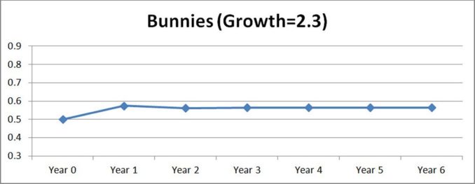
Ok – let’s plug some values in and see what happens. Assume we have a growth rate (λ) of 2.3 and we’re starting with half the field already filled with bunnies (so, Xn=0.5).
Year 0: 0.5 – our starting point
Year 1: 2.3 x 0.5(1 – 0.5) = 0.575 (after year 1, the field is now 57½ % covered in bunnies).
Now plug the year 1 value of Xn=0.575 back into the equation to get a prediction for year 2 etc.
…and for years 2 onwards we get 0.5621, 0.5661, 0.5649, 0.5653, 0.5652, 0.5652
So in year 2 the population drops a little, (due to predation disease etc) but between years 2 and 3 the population bounces up before settling on a stable single number by the end of year 5. By then if you keep iterating the equation you’ll keep getting 0.5652. So, the rabbits are breeding, but they’re also dying out. The two components of “life” and “death” result in a balanced population with one single fixed point of population (0.5652 or 56.52%). Graphically our result for this 6 year period will look as follows:-
Reducing the growth factor (λ)
Now imagine that the growth rate reduces to 0.5 because some horrible disease such as myxomatosis has caused a large number of male rabbits (in our half filled field) to become infertile.
What happens now?
Year 0: 0.5
Year 1: 0.5 x 0.5(1 – 0.5) = 0.125
Years 2 onwards gives: 0.0547, 0.0258, 0.0126, 0.0062, 0.0031, 0.0015, 0.0008
Unsurprisingly if the fertility rate reduces sufficiently (ie: goes below 1), then within around 8 years this population of bunnies will nosedive and in time, die out.
Thus far and purely as a paper exercise, it feels like we’re seeing something useful here.
Increasing the growth factor (λ) to 3.2 – something new happens
Let’s now increase the growth factor to 3.2, again with half a field of bunnies.
What happens?
Year 0: 0.5
Year 1: 3.2 x 0.5(1 – 0.5) = 0.8 (after year 1, the field is now 80% covered in bunnies)
For years 2 onwards we get 0.512, 0.7995, 0.5129, 0.7995, 0.5130, 0.7995, 0.5130 etc
So something new has happened. When we reach year 3 the population now bounces between two values 0.79 down to 0.51 and then back up again and those values closely repeat. Graphically over the 7 year period you’d see the following:-
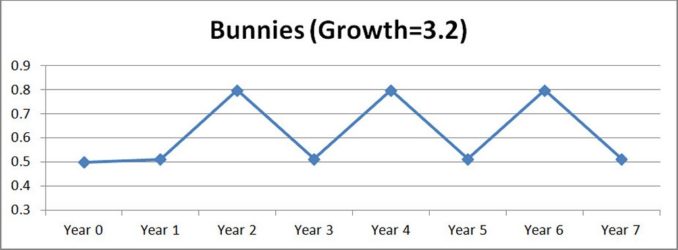
This isn’t totally unreasonable: a large population might attract predators like foxes, capable of significantly reducing the number of rabbits. So perhaps after 12 months of good meals leaving far fewer rabbits, the foxes might head elsewhere for easier pickings, thus allowing rabbit numbers to increase. Foxes would be wise to head back to this field every 2 years or so!
Increasing the growth factor (λ) to 3.5
What happens if we increase the growth factor to 3.5, again with half a field of bunnies?
Year 0: 0.5
Year 1: 3.5 x 0.5(1 – 0.5) = 0.875 (after year 1, the field is now 87.5% covered in bunnies)
For years 2 onwards we get 0.3828, 0.8269, 0.5009, 0.8750, 0.3828, 0.8269, 0.5009, 0.8750, 0.3828. Graphically this looks as follows:-
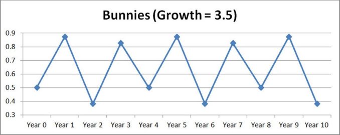
So again we’re seeing something new. The population is stable but this time following a cycle of 4 population values. 0.3828, 0.8269, 0.5009 and then 0.875.
First one population value, then two and now four.
For such a simple equation, what precisely is going on here?
Something new perhaps?
Back in the 1960’s and 70’s, scientists using this model of population growth were surprised by the unexpected cycle change we’ve just uncovered. Why would such a simple equation end up at any of the following outcomes:-
- No growth
- One fixed value of population,
- A population swinging between two, four or who knows how many values???
…and this specific problem wasn’t the only difficulty they were having. If the growth rate λ was increased much beyond around 3.5, the results were really very random, at which point everyone figuratively ran-home-to-mummy, concluding they were probably seeing “rubbish” and “noise”. The odd behaviour was seen as an inconvenience and they spent zero time trying to understand why it was there.
Curiosity
In the 1970’s a chap called Mitchell Feigenbaum became interested in this issue. He studied the intervals between period doubling (from stable populations of 1 to 2 and from 2 to 4), wondering if some kind of regular scale factor might be involved. When he divided the intervals of growth rate between one period change and the next, he found they honed in on a single number, which by 1975 became known as the Feigenbaum constant (approximately 4.669). Each consecutive doubling occurs 4.669 times faster than the last. This constant was surprising, but when he looked at other similar equations in different areas of work (structural engineering, marine design, climate analysis to name but a few) he found they all exhibited period doubling and the interval was always 4.669. So he’d actually stumbled on a universal constant.
Feigenbaum thought of a way of visualising this by changing the graph. Instead of looking at population against time, he looked at population against the growth rate value (λ).
But you’ll recall above, when we tried a growth rate of λ=3.2, we ended up with a population cycling between two different values and we only found that out after running our equation 8 times. Similarly, a growth rate of λ=3.5 ended up with a population cycling between four different values and again we only found that out after running our equation 10 times.
You see the problem?
He realised that he’d need to take each new growth rate value, plug that into the equation and run it maybe 10, 20 or 100 times (whatever was required to settle down) so that he could find out if the predicted population of rabbits would settle on 1 value, 2 values or however many values. He’d then plot a point for each stable population value he found for that particular growth rate.
If we do this for λ between zero and 3.5 (using our results above), we’ll get a graph that looks as follows. I’ve added extra data to this to show the proper curves and if you model this equation, using more results, you’ll get the same structure:-
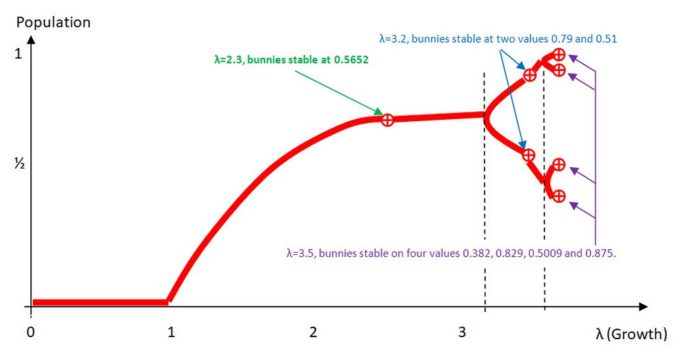
On the left side, when λ is below 1 we see the death zone. The bunnies aren’t fertile enough and die out. After that we see a gradual rise in population (stable at one size) as λ heads towards 3. Then the population stabilizes on two values and shortly after that, on four values. The magic happens when λ becomes even larger, as shown below. Note the only significance to the colours I’ve used is purely to highlight the areas we’ve already looked at (shown in red). The black and white area is what comes next once the growth rate λ increases above around 3.59.
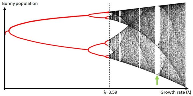
Feigenbaum created a program to draw this using a printer, which happened to be located elsewhere in his building. Rather famously, the printer engineers took one look at these noisy ugly images coming out and decided to “clean them up” a bit before he popped over to collect them. It took a while for Mr F to figure that out.
There is structure and yet it looks almost random. In fact if we expand a section to make the green arrowed area larger, you can see that the chaotic behaviour stops abruptly on a gap, exhibits new order before descending again into a different type of chaotic behaviour.
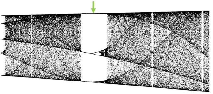
It has a strangely organic complexity and it doesn’t repeat in any predictable way. If you’re anything like me, you’d be hard pushed to say what the patterns actually are or what they mean.
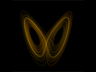
Feigenbaum uses a single dimension to draw these values but the actual patterns he had found turn out to be part of a much larger and quite popular set, known as the Mandelbrot set. This astonishing and beautiful representation of the complexity inherent in very simple equations is shown below.

I’ll do my best to pen some thoughts on the Mandelbrot set in a future post as I suspect most of you will have seen it, but may be less sure how it comes about. As a primer, have a look at these two utube videos here and here. The first point to keep in mind is that the colours are purely arbitrary and have no great significance. Using our bunny population as an example, the colours would be selected based on the number of stable bunny populations found for each single growth rate value. One colour for a stable population of 1. A new colour for 2 etc etc and probably where the two would be quite close together on the spectrum so that the border between the two appears visually smooth. In both video’s, the numerical precision of the calculations is increased (acting like a zoom) but sitting at a particular coordinate in the complex plane. The starting point has to be picked carefully, otherwise you easily end up in the main cardioid area (the black part) or the darker blue outer part – both of which are dead areas. But that narrow edge separating the two areas has almost unlimited levels of complexity and an exquisite natural beauty that is as intangible as it is unreachable.
The edge of chaos is where everything interesting happens.
Conclusions
So, our bunnies reveal a bit of a paradox.
On the one hand we have a nice simple population system which is deterministic, meaning if we plug the same starting value into the model we’ll get the same results every single time we use it. In years gone by, mathematicians would speak of this as boring, predictable and uninteresting.
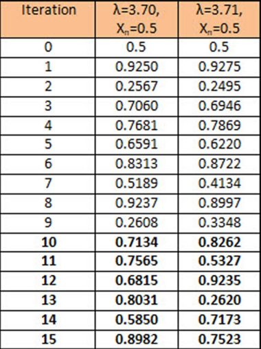
On the other hand, we have significant complexity. If for example we compare the population results for a growth value of say 3.70 against those for 3.71 – just one hundredth larger, not only will the values differ, but by the 10th generation of bunnies the predictions won’t even be recognizably similar.
Formally this is known as sensitive dependence on initial conditions and it is a particularly significant characteristic of any complex system, especially the climate. It places a fundamental limitation on our ability to predict climate over any significant period of time (low numbers of days) for it is impossible to measure all the millions of inputs to the climate system and to the infinite degree of precision required. Consequently, weather forecasts always deviate from observed reality within hours; and within days, you’d actually be better off using tables of annual weather averages, rather than rely on any long range met office forecast.
Anyone who claims otherwise, is wrong!
Go further and look at the almost beat like pattern of our bunny population results and you find a level of order and structure that cannot be accounted for. It is there, we can see it, but we don’t know why it is there, which is all the more strange given the very high levels of complexity in its form.
Chaos theory wasn’t born at this point, but it was definitely a seminal milestone in the development of what would become more formally known as Complexity Theory or the study of non-linear dynamic systems. More precisely: Complexity theory is an area of mathematics grappling with hidden and very complex order in complex systems which is sometimes life-like and often very unpredictable. The deeper we look, the more we realise the number of subtle and deep links between the complexities we see in the natural world and the abstract world of mathematics.
In my next post, I’ll spend a little time chatting about Ed Lorenz who noticed something odd when he tried to model the weather.
© text & images Verax Cincinnatus 2023