I was bored the other day and decided to download the Office of National Statistics Weekly Death data for England and Wales for the last 5 years (as you do). It can be found here and here.
I’m not a statistician or mathematician, I have an engineering background and I work with large amounts of data for a living. I thought I would have a quick look through the ONS data in Microsoft Excel for myself. I am not doing detailed forensic work on the data, I’m not looking at shifting demographics, I’m not running the data through weighting algorithms or any of the other statistical tools you can use. I’ll leave that for people such as Ivor Cummins whose detailed works can be found here.
I ignored Scotland (and Northern Ireland) data as not only was the dataset smaller, it was also on a different site and collated differently, and not to put too fine a point on it, I couldn’t be arsed! Also, I found out that in England and Wales we have around 1,500 deaths a day (~400 from heart disease, ~350 from cancer, ~200 from dementia and so on). This is around 10,000 deaths a week.
I just wanted to do a plain old eyeball on the data and make some pretty graphs.
The first graph I generated consisted of five year’s worth of weekly deaths in England and Wales. It’s starts off with the usual rise in winter respiratory deaths followed by a big spike in March/April this year when COVID-19 hit, then just as quick as it happened it faded away. Towards the end of the year we see a slight rise in weekly deaths compared with the last five years.

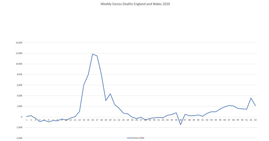
The second graph I generated was to show the excess of weekly deaths from the 5-year average weekly deaths. As you can see earlier in the year pretty normal until a big spike at the beginning on April from COVID-19 and then at the end of May the figures are back to the norm. Once again, towards the end of last year there’s a slight rise of excess deaths that looks like it has peaked.

Totalling up the 2020 figures we have a yearly death toll of 614,000 versus the five-year average of 539,000 leaving an excess death total of 75,000, of which 60,000 were in the covid spike (all figures rounded up).
I then looked at the age profiles of those weekly deaths (note: not deaths that tested positive with the PCR test within 28 days – ALL deaths) and generated this graph.
You can quite clearly see the covid spike in week 16 and the slight rise towards the end of the year. What strikes me though is that the age grouping under 60 years of age is pretty much static and rises slightly in the covid spike. The 60-79 age group has a slightly more pronounced spike starting at week 16 and the main spike (double) is in the 80+ age group.

What is remarkable is that the under 60’s age group only showed a small spike of an extra 700 weekly deaths at the height of the covid spike before quickly settling down to the norm. It is also quite clear that the 80+ age group were the hardest hit in April.
In the next graph I isolated the 80+ age group so you can see the shape more easily. Apart from the covid spike, the drop and then the seasonal respiratory winter deaths, it shows that the bulk of the deaths are due to those folks in this age grouping, due to covid or not due to covid.

The point I want to make is this: during April and May last year, whether lockdown or the non-wearing of masks made any difference or not, the NHS wasn’t “overwhelmed” despite the large spike in excess deaths.
So why are the government convinced we need severer lockdowns, mandatory mask-wearing and vaccines today when this recent data shows quite clearly the level in excess deaths is no way comparable to earlier last year?
Why are they doing this?
Beware of Geeks Bearing Gifs can be found on Gab here.
All graphical images by Beware of Geeks Bearing Gifs
© Beware of Geeks Bearing Gifs 2021
The Goodnight Vienna Audio file


