© Always Worth Saying 2022, Going Postal
The truck now leaving a back lane behind your local railway station may well be removing the mangled remains of a giant departure board. Why so? Because they’re being replaced, and by creatures not even known as ‘departure boards’. The new rage is for ‘customer information screens’, giant RGB TV displays that show ‘customer information’. Excuse me, let’s bang that on the head from the outset, to display train departures.
Worse than the vandalism is that customers … ah, excuse me again….. passengers really like them, thinking the Johnny-come-lately versatility, higher resolution, extra colours and moving graphics is better able to display to them what they need to know. As far as the station operating companies are concerned, the new order confers a benefit to in the shape of giant full colour moving onscreen advertising. On a particularly bad day, such things can be programmed to read nothing other than ‘Thank you NHS’. Dear God.
But I’m sure I’m not the only Puffin who feels a tear swell in the eye, accompanied by mild pain in the ear, when he recalls an older and better way of doing it. Colloquially known as the ‘rattleboard’, their proper name was ‘Solari board’, named after the Solari di Udine company who designed and manufactured them in the West. In Eastern Europe, they were known as ‘Pragotron’ after the Czech manufacturer on the other side of the Iron Curtain.
The original Solari was installed at Liège-Guillemins railway station in 1956 with the first UK example part of the rebuilt concrete trough that was London Euston in the early 1960s.
The boards were made up of cells that could display a letter or number via a rotating split disk containing the alphabet. This gave them another of their proper names, a ‘split-flap display’. According to the US Patents Office, tilting plates are hinged on horizontal rotary drums and driven by two oval gears, to display text as well as hours and minutes indicators.
All the characters are contained as halved flaps attached to a rotating disk. As the disk rotates, one half of the character will be displayed on the top flap and the other on the bottom. Consecutive characters can be shown on opposite sides of the same rotating flap so you only need 13 full plates to contain the whole alphabet. As ever, these things are better explained via a drawing borrowed from Wiki.
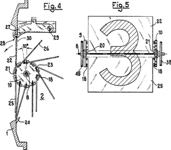
Inner workings of a “flip clock”,
E. Cappellari – Public domain
When large numbers of these cells are assembled in a grid, sufficient information can be displayed to inform passengers of the next set of station departures.
Being electromechanical and having lots of moving parts, they made a characteristic rattling sound as the display updated itself when the top train departed and all the services detailed beneath moved up one. The sound had a use, creating a sense of occasion and alerting all present to an update to the information displayed.
Everybody’s favourite was the giant example at Paris Gare du Nord with sufficient columns for departure time, destination, serval intermediate stops, type of train, onboard facilities (graphics of wine glasses, knives and forks, beds for sleeper trains), type of service, train number and the departure platform. At the bottom right was an LED showing a 24-hour digital clock with the rest of the lower part of the board allowing for three lines of Solari text giving general station announcements.
The top of the board, in white on a blue background, announced ‘Departure’ in French, English and German following a convention found all over the continent at main, and especially at international, stations.
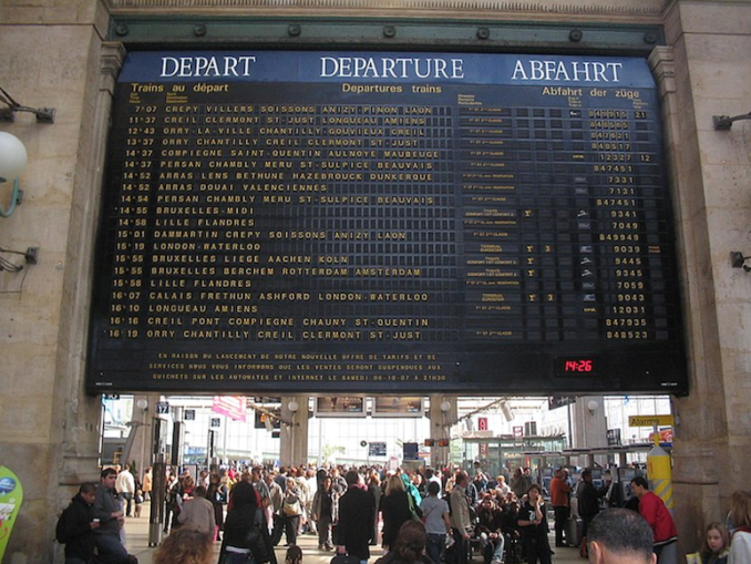
Flap (Solari) display departure board at en:Gare du Nord, Paris, France,
L.Willms – Licence CC BY-SA 3.0
The Gare du Nord example sat nicely into a squared archway between the station hall and the platforms. Elsewhere in France, the boards were of a different style, letter box shaped, black with silver piping.
Another notable departure board is at Brussels Central where a monumental pale stone surround announces VERTREK DEPART at either side of an analogue clock sitting above the display which in turn sits above ticket office cubicles. Closer inspection shows the gird of cells aren’t Solari. They are flat rather than rattly and are solely electronic with cells made up of LEDs that light in different combinations in order to form characters and numbers. On these LED type boards, the cleverer the shaping of the LEDs the smoother the lettering can look. At the other end of the spectrum, cells are made of identical round bulbs which reveal low-resolution lettering as some bulbs light and some didn’t.
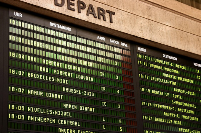
Train departure board at Brussels Central Station ,
Marek Ślusarczyk – Licence CC BY-SA 2.0
It wasn’t always so. Rightly trapped in the days before electromagnetism, Solari or LED, Glasgow Central retained printed wooden boards displayed on windows above the ticket office until the 1980s. As a terminus with long turn-around times while train crews were changed and carriages cleaned, departures could be shown in their matching window for a long time and in platform order. There was a similar arrangement at Aberdeen. Hear hear.
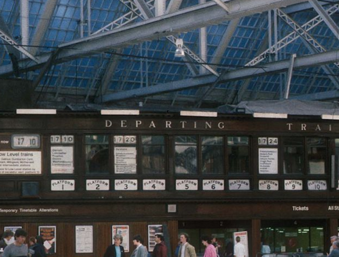
The Caledonian Railway destination board on 21 May 1985,
Pencefn – Licence CC BY-SA 3.0
Also in the 1980s, although sophisticates elsewhere in the Hellenic republic had black and white LED boards hanging from the ceiling, those who understood the deeper intention of the Gods of travel passed out handwritten sheets, reproduced on a banda machine, with all the information ‘customers’ needed regarding the day’s departures on Athens Peloponnese’s narrow gauge line.
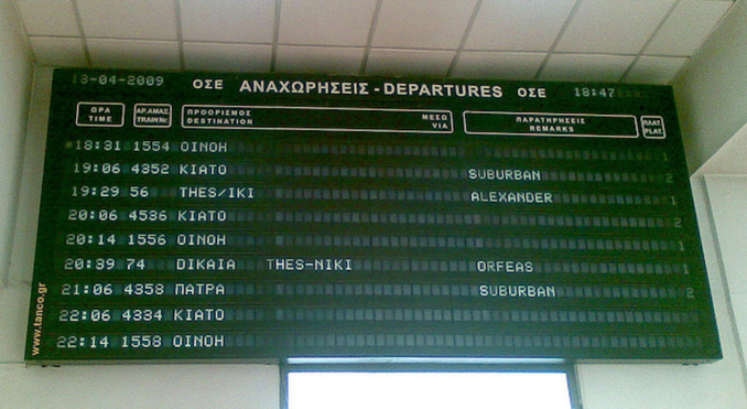
Departures board at Athens Central Railway Station,
T. Hermola – Licence CC BY-SA 3.0
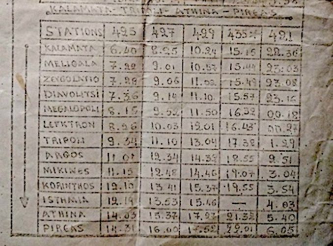
© Always Worth Saying 2022, Going Postal
Better times!
© Always Worth Saying 2022


