

To give everyone a rest from the military stuff, I thought I’d share one of my ways of retreating from the stresses of life, politics, the media and people. Watercolour painting is a good starting point, it’s cheap, there is loads of stuff out there in shops such as The Range and The Works (other retail outlets are available), plus it takes up little space and a cat can’t traipse across your pallete and leave colourful acrylic paw prints across your carpets. Watercolour painting is something you can do with the minimum of kit.
One of the main reasons people tend to shy away from starting is the “I can’t draw” excuse. Clearly some people have a natural talent for art, but being able to draw is like most things, you can teach yourself how to do it. There are a lot of books out there, showing how to draw most subjects from figures, animals and landscapes. At the end of the day it’s a hobby or pastime.
The subject can be whatever you like, a holiday photo, something from a calendar or a picture from the internet.
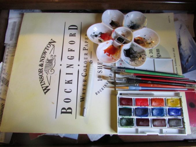
Paper
I buy mine in pads but you can buy separate sheets in A1 and cut them to size. The paper comes in different weights, Watercolour paper is measured by how much it weighs per 500 sheets. The heavier the paper, the more it weighs and the more water it will take without buckling. The three standard watercolour paper weights are 90, 140 and 300 pounds.
90 pound watercolour paper will accept a fair amount of water, but is best used with less water than the average watercolourist uses and cannot survive a lot of “scrubbing” or abrasion of the paper. It is also the least expensive.
140 pound watercolour paper is probably the most commonly used paper by watercolour painters. It is thicker and can handle quite a bit of water and scrubbing. (140 pound paper has a mid-range price tag as well.)
300 pound watercolour paper is probably the strongest, heaviest paper you will ever need. This weight of paper is like card stock and needs no stretching. Heavy 300 pound paper will dry flat without buckling and can take quite a bit of abuse. Naturally, it is also more expensive.
Once it has been covered with water the paper will buckle and remain like that; this is called cobbling and doesn’t look good in the frame. To avoid it stretch the paper by wetting it and then fixing it to a board with gummed brown tape. When it dries it will remain flat, hopefully whatever you do to it. You can stretch it before or after you have drawn your sketch in pencil.

Brushes
Have a reasonable selection of brushes with a large sable to put down a covering wash, to a 00 for fine detail, with all sizes and grades between. Your brush collection will grow as you do more paintings, but you still don’t have to spend a fortune on them.
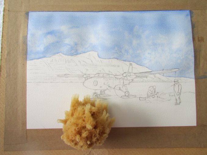
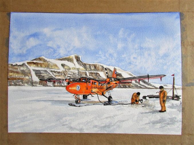
For the subject I chose a photograph of a British Antarctic Survey Twin Otter aircraft on a glacier, drilling for ice samples. It will be a limited pallete where the orange of the aircraft should stand out against the monochrome background. For the painting I used six colours ranging from Prussian Blue to Paynes Grey with a couple of ochres, orange and red. I used Windsor and Newton pan watercolours but the cheap stuff from The Works is just as good, but it probably won’t last without fading for 200 years.
There are two techniques to master with watercolours: wet in wet and wet on dry. If you apply paint to a wet surface it will bleed. This is good if you want to blend paints without a demarcation line or for putting down a background wash. Wet on dry gives sharp demarcation lines. Plastic paint mixing dishes are also very cheap and you can even use plate.
Unlike Mr Edge, my washes and painting in general can be a bit indifferent. For this painting the sky is a wash. Start by wetting all of the area on the painting where the sky will be. Not too wet, moist and hold the paper up to the light to see if you’ve missed any bits. If you go over your demarcation lines the paint will bleed into where you don’t want it to go. If this happens go over the area with a clean moist brush to lift it off before it dries. Put the paper and board at 45 degrees and with a full pan of Prussian blue, start at the top and lay down the wash. It will go down the paper by capillary action and pool above the horizon. Lift it from the horizon with a clean, damp brush.
While the sky is still wet, you can put in clouds by lifting the paint. I wanted the effect of small clouds bubbling up over the background hills, so I used a sponge and dabbed off the paint. For larger clouds, use a piece of kitchen roll and a grey can be added for the cloud base while the paint is still damp.
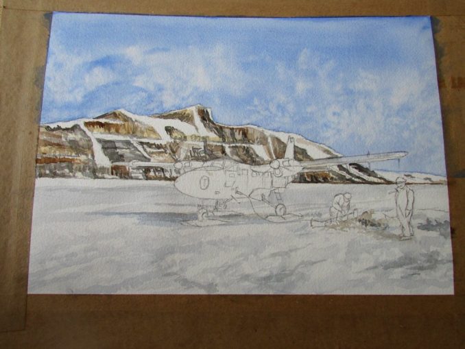
The next stage is to put down some of the coloured washes in the background hills. Obviously the areas of snow are just unpainted paper. Sometimes a tinge of blue can be very effective on snow to denote light reflecting off it. The shadows are added under the aircraft and where the two figures are standing, plus the churned-up snow around the fuel dump. Some more detailing has been added to the hills.
The final part probably takes the longest. The Twin Otter is built up with two colours, orange and red and the paint has been lifted from the areas where the light reflects off the aircraft. This is done with a clean, damp brush before the paint dries. The shadows on the snow are wet in dry as the demarcation gives a nice, crisp feel to the shadows. I added a hint of orange to the shadows under the aircraft, to allow for it reflecting on the ice. I also did some more to the hills, but had to tell myself to stop fiddling. The starboard engine is running to provide power for the blokes on the ice.
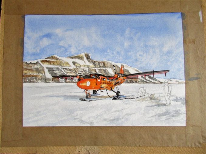
The final part was adding the figures, the fuel dump and some final detail. I didn’t waste too much time on the figures as the subject should be the aircraft. Hopefully the composition leads the eye from top left to bottom right. Composition is one of those subjective things and a personal choice. If it works for you then great. The rule of thirds is a good starting point. The finished painting is below. It took six hours on and off over a rainy bank holiday and at least it kept me away from Mark Bloody Edge.
Good luck.
© text & images Blown Periphery 2018/2023
Goodnight Vienna Audio file


